PivotTables For InfoSec Dummies

Plenty of people know how to toss an IP address and port list into Excel for sorting and searching but don’t get a chance to take it to a deeper level. Excel pivot tables are a great next step to explore, offering a simple yet potent interface for data analysis. Dynamic pivot tables can be friendlier than on-the-fly bash with grep, cut, sort, uniq, sed, and awk commands. Additionally, Excel can be more accessible than alternatives, especially for newcomers to the security space.
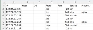
During initial assessment recon, I commonly run SpooNMAP and save the Nmap output to an XML file. A handy tool, Nmap-xml2csv, creates a simple CSV file from that XML data, which imports nicely into Excel. For this example, we’re using a fictional scan from the private side of a multi-branch office DMZ network.
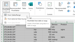
Although the Excel interface has changed over time (and will likely continue to change), a high-level setup generally involves highlighting the CSV data and inserting the pivot table. (I personally prefer to put tables in new tabs if offered the opportunity.)
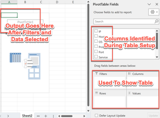
After it is created, the table will appear empty. A new interface will be available that allows us to slice and dice data dynamically.
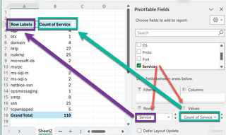
Let’s start with a simple summary to see how much of each service was picked up on the scan. By dragging the “Service” down to “Rows” and then again dragging “Service” down to “Σ Values,” we get a summation of the instances of each service picked up in the Nmap scan. (Continue on in the article if you get a “Sum” instead of a “Count” within the “Σ Values” box.) In this example, several things look interesting for a DMZ.
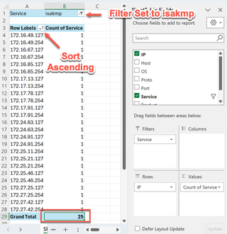
While the obvious Windows boxes living in a DMZ raise my eyebrow, I’m a bit more interested in the relatively high quantity of ISAKMP services. Let’s get some details on that. Let’s move “Service” to “Filter” and drag “IP” to “Rows”. After the data shows up, we can adjust the filter to show only isakmp and sort the IP rows in ascending order.
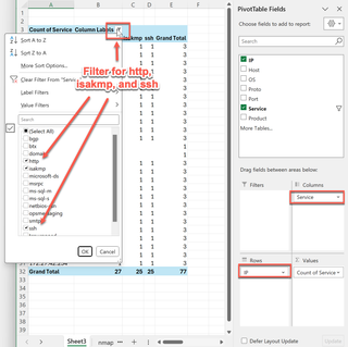
After making sure the auto-calculated grand total matches what we expected, I’m drawn to the pattern of the last octet in the IP addresses. Additionally, the HTTP service and SSH services noted earlier have similar counts. Let’s move “Service” to “Columns” and filter the columns for isakmp, http, and ssh.
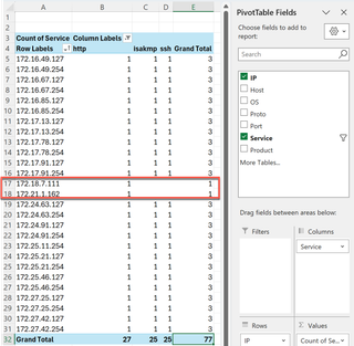
All 25 of the hosts we were curious about include web and SSH services. With that, and the curious limit of the last octet existing at the end of every /25 IP address range, I would proceed with the notion that these are VPN gateway devices, and the IP address spaces are some sort of logical organization of branch offices. I’d be curious as to why HTTP was available but not HTTPS. Also, the entire scan included two (2) other IP addresses with HTTP services available. Let’s quickly pivot to those.
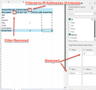
Even more curiously, the system at .111 appears to only be running unencrypted HTTP. Maybe it’s unintentionally exposed? I would make sure that gets some attention. The system ending in .162 has several important services available. Perhaps it’s some sort of aggregated service host; I’d consider it worth spending some time with. Let’s start again and look at a new angle by viewing IP addresses, hostnames (where available), and open ports. Uh-oh… something is not right…
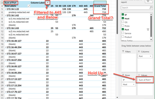
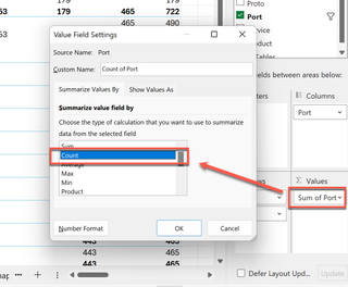
What happened here? Excel identified the “Ports” value as numeric and is attempting to help us by adding them together. We can make this useful again by changing the “Σ Values” to “Count” instead of “Sum.”
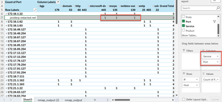
Changing to counting and adjusting the columns, we glean another nifty tidbit. Looks like there may be a production ERP system running Windows here. This is also a shiny object for assessment!
In summary, it’s incredibly easy to dive into Nmap results with pivot tables. Simple drag-and-drop pivots help identify outliers that may be vulnerable (such as an old JetDirect service sitting all alone in the address space) or glean helpful information about higher-priority targets (such as an SQL server with unnecessarily exposed ports). If you wind up with a mess of a table, it’s trivial to just clear everything and start over. Consider giving this a try next time you find yourself time constrained and with a few too many IP addresses to look into.